Here’s a head-scratcher for you: You’re getting a lot of traffic on your site, but you see that your bounce rate is astronomically high. A lot of people are leaving your site, and you’re stumped as to why.
Sometimes, a couple of factors can cause people to leave your site. Whether it’s dead pages, confusing navigation, or a bad user experience, it’s important to figure out all the possible reasons why people are leaving your site and work on fixing these issues.
Here are a few ways you can try to decrease your bounce rate and keep people on your site longer.
Create an awesome landing page
As with any first impressions, your first point of contact with a potential customer is an excellent one. That’s where landing pages come in.
Landing pages should do the following:
- Catch people’s attention immediately either with a great graphic or compelling copy
- Outline your value proposition clearly
- Build trust by providing more information and social proof
- Have one main call to action
An example of a great landing page is General Assembly.
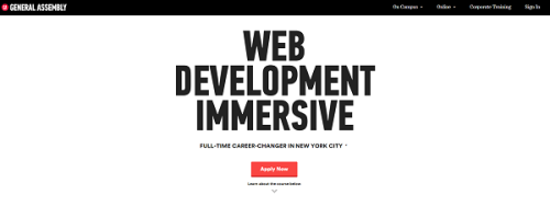
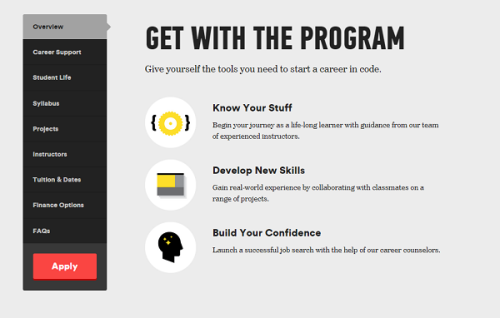
Right from the get-go, they hit you with a huge text banner, and offer you the option to either “Apply Now” (main CTA) or learn more. As you keep scrolling down, they offer a lot of information that helps you get comfortable with their brand while still providing you plenty of opportunities to convert.

The copy on this page is persuasive, giving you many reasons to register for their coding lessons.
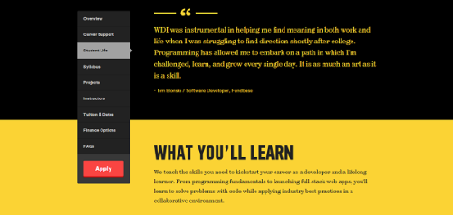
Long-form landing pages like these not only have a higher chance of converting visitors into customers but also keeping them longer on your site.
Minimize distraction
Back in the old days, it was a common practice to have hidden navigation menus, flash animation, and other elements that were all mashed together to create a “website”… kind of like this one:
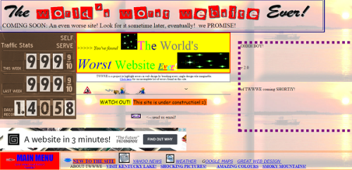
So maybe it’s never been as bad as that website, but you get what I mean. A lot of websites incorporated elements that were unnecessary and distracting. Nowadays, however, a cluttered homepage is stressful and can cause a new site visitor to close the page immediately.
Current web design trends lean towards a simplistic design with plenty of white space, high resolution images, minimal navigation, and digestible content.
Additionally, instead of bombarding users with multiple CTAs, most websites only include one CTA and place it strategically throughout the site in order to provide opportunities for conversion without being distracting.
If you must have a popup, make it clever
Generally, I’m of the opinion that pop-ups are incredibly annoying and create a horrible UX. However, there are exceptions to every rule.
There are some pop-ups that are so damn clever that you simply can’t resist but stay on the site and perform the action they want you to take.
For example, take a look at these exit pop-ups:

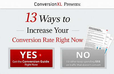
Pop-ups like these will make people think twice before leaving your site because of one reason: human psychology. The way these pop-ups word their options are incredibly clever, because by clicking “no,” it’s almost like you’re admitting a flaw in yourself. And no one wants that.
Clean up your 404 errors
Have you ever browsed on a site, clicked on a link, and hit a page like this:
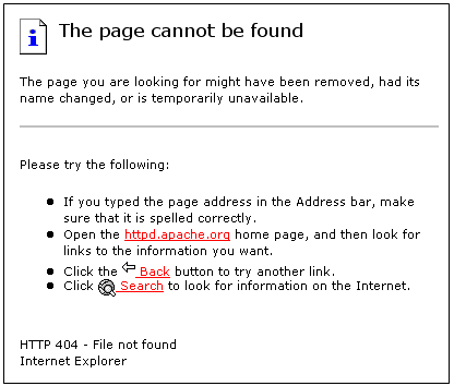
Introducing 404s. 404s are HTTP Status codes that tell site visitors that the server can’t find the page you requested.
Generally, 404s aren’t always bad. However, having too many 404 pages can be dangerous, because they can not only discourage people from exploring your site further but also tell search engines that your site isn’t well-maintained, which is bad for SEO.
So what can you do?
Comb through your internal links and fix any broken links that you can. If you do end up with 404s, instead of showing a boring 404 page, customize them. Take this 404 page for example:

Customized 404 pages that apologize for serving a broken page and direct site visitors to other working pages on your site not only give your visitors a taste of your brand but also keep them longer on your site.
Add internal links
Internal links are hyperlinks that direct users to another page of your website. They not only help search engines crawl your site better but also help users navigate your website more easily.
Adding direct and crawlable internal links is important for SEO and UX purposes, because it lets them easily find all the important pages on your site without having to do too much clicking around.
Internal linking is a subtle but highly effective way to walk people deeper into your site, exposing them further with your brand and increasing their interest in your offers.
Why are people leaving your site?
Every site is different, and ultimately, you'll have look at your on-site user behavior to determine where people are dropping off. No matter what the reason, though, quickly determining the root of the problem and establishing a plan of action to rectify it will help improve your user experience and convince people to stay long enough on the site to convert.