Imagine this scenario.
You're about to open up shop for the day and you (happily) discover that there are 100 people already standing outside your storefront, eager to buy your products. You open your doors, thinking it's gonna be a great day. However, as soon as 40 people enter your store, your doors automatically close and the remaining 60 people can't come in.
This means that you just lost 60% of your potential profit.
Well not having a mobile-friendly, responsive design site is akin to closing your doors to 60% of your potential customers. More than half of global consumers use their mobile device as their primary or exclusive means of searching online. Therefore, if your site isn't optimized for mobile, you're turning them away even before you make your sales pitch, ultimately causing you to lose out on valuable profit.
Here are 3 reasons why you may be having a harder time attracting and closing your mobile leads if your site doesn't have a responsive design,
Reason 1: Your site is getting buried in search results by mobile-friendly sites
This reason will become increasingly prevalent in the coming months, because if you don't already know, Google recently announced that mobile usability will be a ranking factor by April 21. This means that if you have a non mobile-friendly site, you run the risk of getting slapped with an algorithm penalty, which could tank your mobile rankings.
This emphasis on mobile should come as no surprise. Search engines have made it clear that they are giving preference to mobile-friendly sites, ranking them higher in search results.
To prove it, I did a quick mobile search on Google, Bing, and Yahoo - the top 3 search engines - for "red pumps."
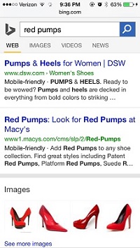
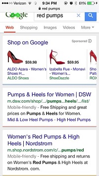

My findings? The same sites ranked in the top 2 positions on all 3 search engines. Therefore, if your site isn't mobile-friendly, you may already be seeing a drop in your rankings, which means lower online visibility, a decrease in site visits, and less chances of visitors converting into customers.
Reason 2: People aren't clicking through to your site
Even if your site still ranks well, despite not having a responsive design, your profit margin may still be in danger because of one small thing: the "mobile-friendly" label.
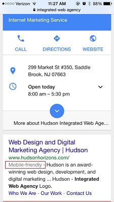
The "mobile-friendly" label is the small annotation next to site links. You'll only see the label in mobile searches, and their purpose is to notify users whether a site is mobile-friendly or not before they click through to the site.
So how will this affect your bottom line? Because if no one is clicking through to your site, how can they see your amazing product offerings?
The effect of the "mobile-friendly" label in search results all comes down to psychology. People will choose the option that best suits their needs in that moment. If consumers are browsing on a mobile device, chances are that they'll click on the result with the "mobile-friendly" label because they know that the site is optimized for their mobile device.
Therefore, the mobile-friendly label - or lack thereof - could negatively impact your click-through rates, causing you to lose out on valuable clicks and site visits.
Reason 3: People immediately leave your site without exploring further
When mobile users search on their device, they tend to be out and about. They're looking for information on-the-go, and they want it fast with little to no hassle. However, if your site doesn't have a responsive design, then it won't render properly on a mobile device. This means that anyone who visits your site from a mobile device will have a hard time reading your site copy and navigating around easily because:
- The text is too small to read on a mobile device
- The page is cut off
- The links are too close together
Therefore, even if people are clicking through to your site, they'll just leave your site without diving deeper into your offerings because their user experience is bad.
How your site looks on mobile may make or break your conversion rates
No matter which way you spin it, mobile is impacting your business strategy. It is not a consideration that you should put off for the "future." The mobile revolution is happening right now, and failing to adapt to this monumentous shift in consumer behavior could mean thousands of lost revenue for your business. Therefore, a mobile-first strategy is necessary if you want to get found by your customers and stay ahead of your competition. So what are you waiting for?